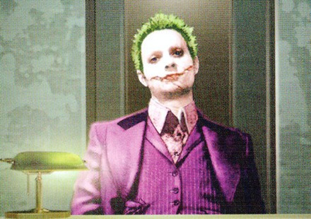
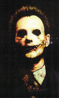
The Art of The Dark Knight has been released with a full script alongside production images and concept art.
The most interesting section in the book is the part covering the early Joker designs — the below images illustrate how gruesome and terrifying the Joker could have been. They almost look like something out of the Texas Chainsaw Massacre.


Comments 6 Responses to “Creepy early Joker Concept Art”
Yeah they are kinda creepy. But i prefer what they went with.
I would have loved if they had this in the dark knight or the third film.
wow… how deliciously grotesque!
likelikelike.…love what they did in movie though.espially his hair.all these have short but he needs long to complete him. one two or three would have been ok too (with long hair).
does anyone else think the second one down looks a bit like elijah wood?
the second is elijah wood the third is trent reznor,there all pics of people that have been manipulated.Its just easier to do it that way.